Font Size Matters
They say size matters… Well, font size that is!
The research is abundant and overwhelming, but we have to let you in on the big news. Size 16 is the NEW size 12.
Ok, we are getting a bit ahead of ourselves here but we couldn’t keep it a secret. The font you choose and the size can actually affect your bounce rate, conversions, and well, everything.
Don’t panic! If anything, take a brain break and regroup. We’ll still be here when you’re done.
In this post, I discuss font facts and the importance of:
- Font Family
- Font Size
- Line Spacing
- Lists
- Bold Font
- Character Limit
Let’s dive in!
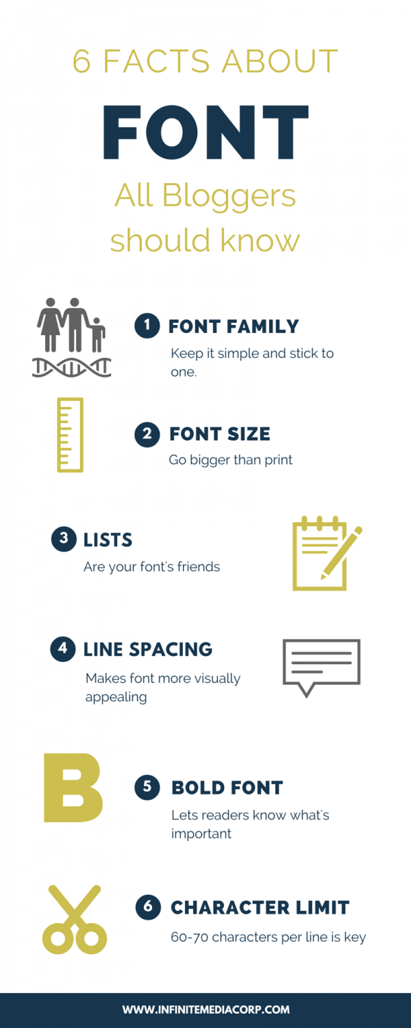
6 Font Facts Bloggers should know (plus Bonus tip!)
1. Font Family
Keep it simple and stick to one. Choose a font that is easy to read and scan for content, without causing headaches. Avoid mixing multiple font families in one blog entry. Sticking to the same font in all blogs strengthens a brand.
2. Font Size
Go bigger than print. The optimal distance from your eyes to a monitor is 28″. Your readers are sitting significantly further away from their screen than a book. Add the difference in reading on a lit screen vs. print and your font needs to be larger, much larger. So we are agreeing with Derek Halpern on this one, Size 16 is the NEW Size 12!
3. Line Spacing
Makes font more visually appealing. Cramping lines together complicates reading. Provide a significant amount of space between lines, but not too much. Don’t scare your readers away and make reading your blog more work than it’s worth. Our ideal line spacing suggestion is 130% (keep in mind this will also depend on your font family).
4. Lists
Are your font’s friends. Lists allow readers to easily scan your article. We know you worked hard choosing every specific word for your blog; however, the average user is there to learn something specific. Lists visually break up your information and provide answers quickly and easily. They make the reading experience more enjoyable for the eyes and brain.
5. Bold Font
Lets readers know it’s important. When you add a bold font to your lists you further the visual appeal of your font. Plus, you are making information even simpler to read, scan, and answer questions. Just don’t overdo the bold, otherwise you negate the point.
6. Character Limit
60-76 characters per line– Set this as your character limit (this includes spacing). If your words scroll forever, it’s intimidating. Again, we are aiming for visual appeal and simplicity. If your lines are too short it creates an unnatural break for the reader’s eyes.
[/vc_column][/vc_row]BONUS!
- Italics – Avoid them. You may think they’re pretty, but the truth is italics are difficult to read. You may want to use them for emphasis, like bold. Stick to bold. From a web accessibility standpoint, italics are not friendly. Users with dyslexia experience difficulty reading them as do screen readers for the blind.
Final Thoughts
How can something so little as font make such a difference? See for yourself…
If a font causes a reader to pause and concentrate because it is harder to read, much like a speed-bump, this creates an increased percentage of information retained.
Now let’s not jump to conclusions, if the entire blog includes a difficult to read font family, your readers will leave the page. However, if you have a specific segment within your blog that is impactful, or a lesson you want your readers to retain, consider complicating the font, just a bit. You will thank us later.
Reach out to Infinite Media Corp on Facebook and Twitter to share what font tips you found helpful. Or let us know which areas of blog writing you find the most challenging. It just might be our next blog![/vc_column_text]


