5 No Fail Formatting Tips for Bloggers

You’re about to create your first blog!
You did your research, developed a plan, and are excited to share your content with the world.
Now, what?
Ideas, research, and enthusiasm are all brightly lit steps on the path to success. However, if you don’t format your content and passion correctly, your blog won’t shine.
In this post, I share my top 5 tips to make your blog a success. These are great for beginners but will keep bloggers of any experience on their formatting toes.
5 No Fail Blog Formatting Tips
1. Font Matters
If the words on your blog are unappealing or hard to see, visitors aren’t going to read them. When it comes to font, be mindful of the size, typeface (e.g. Arial, Times New Roman, Comic Sans), and style (bold, italic, underlined) you wish to use. Remember font should be both attractive and readable.
When setting your font:
- Use at least size 14 font for body text
- Select a typeface that matches your brand
- Avoid using more than two different typefaces
- Avoid ornate fonts or heavy italics for body text
- Never set body text in all capitals
- Bold headings and subheadings to grab attention
- Do not make font a hard-to-read color
2. Keep it Tight
Short paragraphs are easier and more pleasing to read. Aim for one topic per paragraph. A visually perfect paragraph is 3-5 sentences.
Also, aim to use lists and include:
- Bullet points
- White space
- Narrow columns of text
3. Number Order
Statistically, numbered blogs are more successful.
Numbered blogs:
- Help readers measure progress
- Provide organization
- Introduce subheadings
- Prompt interest
- Provide a sense of promise
4. Get Visual
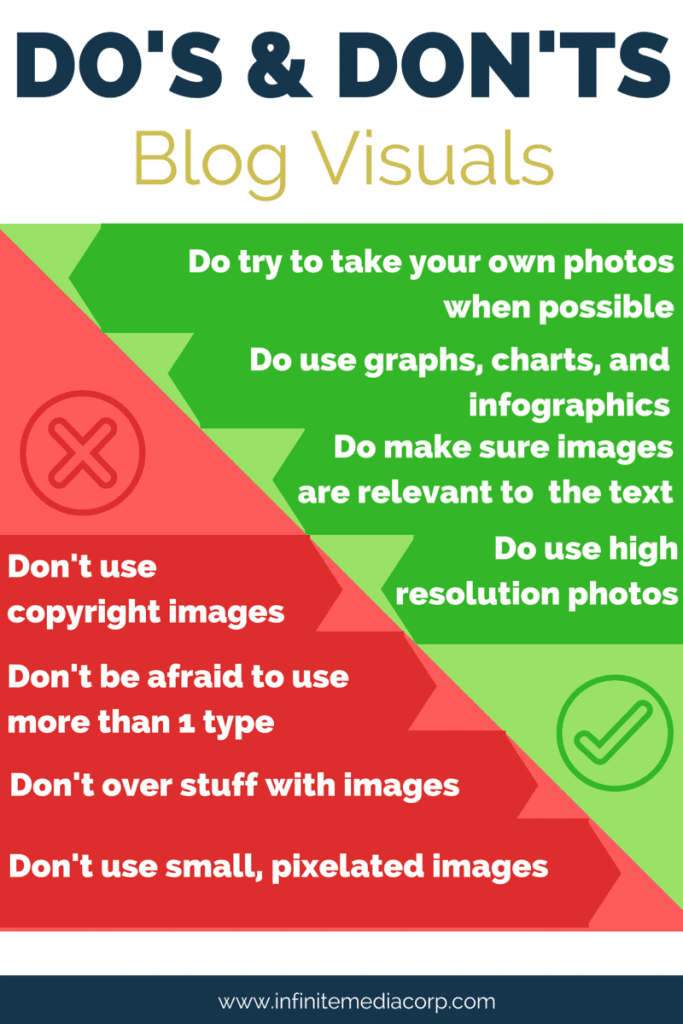
While the right font is a major part of the physical appearance of your blog, nothing is more visually pleasing than pictures.
For example, let’s look at the image below:

Word to the Wise: Make sure your blog images are Web Accessible. Add the ALT tag when uploading your images into WordPress. Your ALT tag (alternative to text) should be a brief description of what the image is meant to convey. If there is text on your image, replicate it in the ALT tag.
5. Consistency is Key
Your formatting goal needs to be consistency. Be consistent in all the items above. Uniformity throughout strengthens brand. The more consistent the elements of your blog, the more professional and reliable you become as a blogger.
Conclusion
Keep in mind that reading on-screen is more tiring than reading print. Most people quickly skim through online posts to find the information they want. If they don’t like the format of a page, they quickly move on.
You want to make sure that your blog is set up in a way that is going to grab the attention of your audience, but also allows for readability.
A blog is only as good as its capability to be read.
Reach out to Infinite Media Corp on Facebook and Twitter to share what font tips you found helpful. Or let us know which areas of blog writing you find the most challenging. It just might be our next blog!


